Caitlin Hines
I’m a Senior UX Researcher based in Portland, OR
MA, Applied Psychological Science
caitlinahines@gmail.com
(760) 855 -8188
Real brain circa 2013. My fascination with the human mind runs deep!

Portfolio Projects
Taking the guesswork out of healthy eating
Diary study, surveys, user testing, user interviews
Case Study 1
Taking the guesswork out of healthy eating
Leveraging qualitative insights to build a mobile feature that increased lifetime engagement & improved weight loss outcomes
Stakeholders
PM, design, data science, product leadership
Methods
Diary study, surveys, user interviews, user testing
Role
UX Researcher
Timeframe
6 months
Detailed Project Walkthrough
Background
Consistent healthy eating is crucial for weight loss but remains a key challenge for users.
We built 5 beta "grocery tools" to support users in food planning and decision-making during their weight loss journey
Research Goals
- Observe real-life use of beta tools
- Understand perceived value and user needs to guide iterative roadmap
- Identify points of friction to refine tools before full rollout
Research Methodology Overview
Design Iteration
Narrowed scope to ‘Food Lookup’ feature
Phase 2
(Food Lookup feature)
Phase 1
(5 grocery tools)
Diary Study
Follow the health journey of users over time to see use + impact of tools
Longitudinal Surveys
See impact + value of tools at scale
Guide iterations via user testing + collaboration with design/PM
Gather deep insight value + impact of Food Lookup iterations
User Interviews
Evaluate efficacy and impact of iterations to drive go/no-go decision
Surveys
CONS
- less structure / no guarantee they will do anything beyond what required
- risk of dropoff during later weeks
Diary Study
PROS
- less parts + each tool has own part
- mix of required + free for all use
Why a diary study?
- Gain rich insight into real-life use
- Observe both directed and natural use of tools
- Gather in the moment feedback on functionality
4 week study structure
- Benchmarking, observe directed first use
- Highs & lows (directed use), week 2 check in
- Observe free use of tools, week 3 check in
- Observe free use of tools, wrap up
Data collected
- Screenshots/recordings of app use
- Photos of food choices + commentary role tools played in decisions
- Quant healthy eating and satisfaction metrics
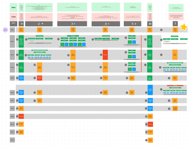
Study design brainstorming in Figjam. Compared 7 options to meet research needs while ensuring study is simple and structured for participants
Surveying
Multiple surveys to evaluate feature impact + build user-centered V2 of the Food Lookup feature
Phase 1
- Longitudinal Surveys (n= 2800 surveyed twice)
- Size impact and validate learnings from diary study
- Measure sentiment & satisfaction over time (day 0 & day 28) to understand impact of feature at scale
“I need to know the [caloric density] AND the calories when I’m looking quickly. I don’t use it anymore bc of that.”
Phase 2
- Generative Survey (n= 1000 active users)
- Understand nutritional elements users look to when making food decisions
- Wide sample of users to uncover any changes over time in program or across segments
- Evaluative Surveys (n= 2400 across 6 surveys)
- Validate value & gather feedback to refine before launch
- Continue learning about use cases
"I feel like I am redefining my relationship with food, the [feature] allows me to make better decisions without over analyzing”
Guiding product roadmap with user insights
Challenging assumptions and driving user-centered deisgn
Hypothesis
Tools should only be given to experienced users to avoid overwhelming new users
Insight
Experienced users felt they no longer needed the tools, wishing they had them when staring
Outcome
Adjusted deployment strategy to include new users
Showcasing caloric density info helps users make food decisions
Users actually need more comprehensive nutritional info (calories & macros)
Iterated to provide detailed nutritional information to users
Naming tools “Premium grocery tools” would attract users
“Premium” deterred users & “grocery” deterred non-shoppers /didn’t convey true value
Renamed tools to better communicate value to all users
Cross-functional collaboration to influence leadership
Partnered closely with Product Manager and Data Scientist during analysis to best tell the story of how Food Lookup had a positive impact on the user experience and the business:
Example 1:
- Data showed that users were disproportionally accessing Food Lookup when not connected to wifi
- Research explained that users utilized the tool at the grocery store and restaurants - two NEW uses for our app!
Example 2:
- Data showed users were returning to to the Food Lookup tool multiple times
- Research explained the many use cases making this a valuable feature and highlighting long-term stickiness
Research Impact
- Reduced initiative scope, freeing up eng & product resources
- Expanded Food Lookup feature functionality to better align with user needs
- Identified new use cases/user base to inform rollout and onboarding
Product Impact
Launched standout Food Lookup feature that increased:
- long-term app engagement (+5%)
- healthy foods eaten (+15%)
- weight lost (+10%)
Remains one of top used features in the app!
Project 2
Uncovering the path to sustainable weight loss
Mapping the behavioral and mental journey of weight loss users to drive design ideation
Stakeholders
PM, design, data science
Methods
Existing research review, quant & qual survey, user interviews
Role
UX Researcher
Timeframe
3 weeks
Detailed Project Walkthrough
Background
The team explored ways to support users on their weight loss journey, hoping to leverage insights from successful users to focus our design sprint.
We knew successful users made healthy changes sooner but lacked insight into their activities outside the app.
Research Goals
- Learn how users think about progress towards health goals
- Determine barriers to positive habit change
- Identify changes successful users make to promote weight loss
Research Methodology Overview
Existing research review
Interview successful users
Survey of active users
Mapping & persona development
Share out & workshop
Learn the changes made by those who hit their weight goal
Build research artifacts to use in design sprint
Review existing survey datasets to identify known challenges & progress indicators
Fill in gaps from previous research & quantify behaviors/
challenges
Review learnings & lead session pulling out key behaviors and user needs
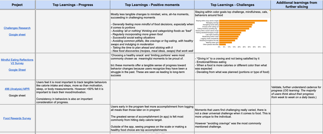
Existing Research Review
Reviewed 11 existing survey datasets to:
- Leverage existing team knowledge
- Identify knowledge gaps for further research
- Design large-scale survey to quantify feelings, challenges, and behaviors
User Interviews
Interviewed 8 “successful” users for an in-depth conversation about their path to healthy habit change

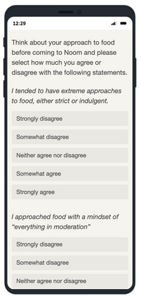
Example interview questions
Survey
Developed a survey to explore the mindsets, behaviors, and challenges of a wide range of active users and performed segmentation analysis
Design Sprint: Journey Map
Answered stakeholder questions with qualitative data
How do elements differ across successful and unsuccesul users?
What were users thinking at this phase? What was their mindset?
What is driving users?
What were users doing during this time? What changes did they make and why?
What difficulties did they encounter while changing or maintaining habits?
What do users NEED from us at this point in their journey? How does that change over time?
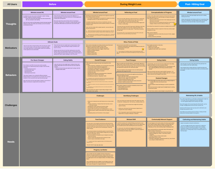
How do these thoughts and feelings differ before and after hitting weight loss goal?
*Learning details intentionally obscured
Design Sprint: User Personas
Developed personas to illustrate changing behaviors, mindsets, and needs throughout the weight loss journey
Lost little weight Lisa
...joined program feeling excited and motivated tired of her weight being an issue...she finds it frustrating not seeing progress on the scale, so she looks to other measures like how her clothes fit and celebrates small day-to-day wins...
Halfway to goal Hank
...despite his initial momentum, Scott struggles to hit his calorie targets and notices things are slowing down. He believes in "everything in moderation" but feels he might need more moderation with some foods and is unsure where to make the next change...
..
Met goal Mandy
...her early journey involved experimenting with new foods and cooking techniques to find healthy, delicious options. She’s found success through focusing on balance and fueling her body consistently. Now, she measures progress by her mindset and how she feels, not just the scale.
Design Sprint: Defining Focus through UXR
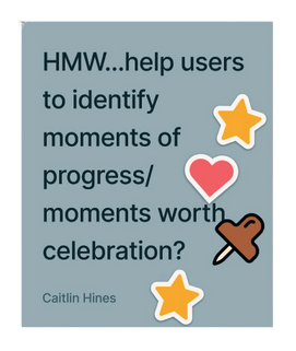
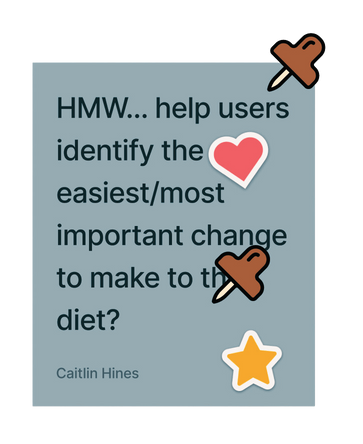
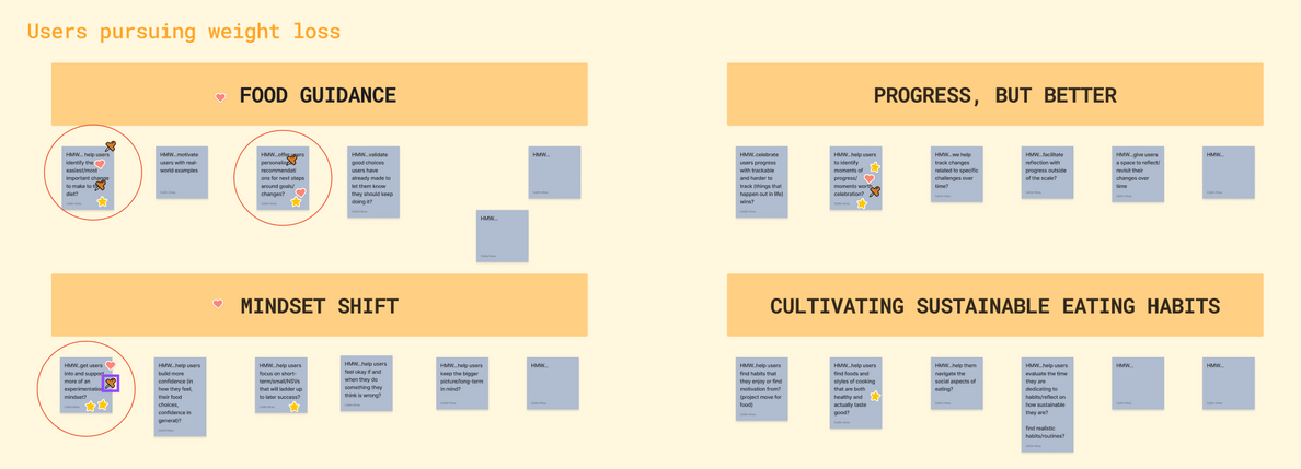
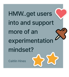
Facilitated team workshop to pull out key user need themes and brainstorm “How might we’s” to use in the next phase of the sprint
Research Impact
*Project was deprioritized in the middle of design sprint, before any design work, however, this work did have an impact on the larger team:
- Built user empathy among stakeholders
- Boosted interest in offering food guidance, cited by designers in recent work
- Identified the “mindset shift” successful users make, cited by designers recent work
- Challenged internal definition of user "success."
- Showcased how combining data + UXR gives a holistic picture of the user experience
Project 3
Exploring ad click intent & drop-off patterns
Testing ad creatives and identifying characteristics of low-intent user groups to assist with marketing during peak season
Stakeholders
Growth PM, creative, Growth marketing
Methods
Dscout “Express Media Survey”
Role
UX Researcher
Timeframe
2 weeks
Background
New ad creatives were seeing clicks, but users were dropping off immediately after arriving on the landing page.
The growth team branded these users “low-intent”, hypothesizing they were unlikely to convert after clicking an ad.
Research Goals
- Identify characteristics of “low-intent” users attracted to ads
- Learn which ad elements appeal to low-intent users
- Understand why these users may immediately drop off website
Research Methodology
Challenge
Inability to target drop off users (we did not have their contact information)
Needed rich qualitative feedback from a large, diverse sample
Very tight timeline
Research Design Requirement
Dscout “Express Media Survey”
(n=60)
Quant +qual media-rich survey across wide population
Demographic data easily available
Ability to collect qual feedback on ad designs AND understand user needs for segmentation
Target consumers/potential users with available demographic data to align sample with low-intent characteristics
More depth than a traditional survey, needed an easy way for users to share more with us
Needed quick method. Not enough time for many 1:1 user interviews
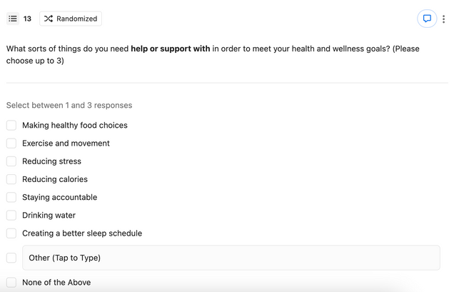
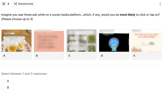
Examples of questions in media survey

Top Takeaways
*Note: As was communicated to the team, these learnings are a signal but would require additional research to determine if segmentation trends are generalizable to a larger population
Characteristic data for each not included due to privacy concerns, however we identified 3 groups of low-intent users in our sample:
- Women in their 20s
- Men in their early-mid 20s
- Men mid 20s-early 30s
Who are the “low intent” users clicking ads?
Why are they dropping off so quickly?
Users want information FAST
- 17% would drop off immediately if not given answers on the landing page
- 83% were curious enough to click through a few more times, but had little patience and would quickly leave
Research Impact
- Helped Growth & Marketing teams to understand the behavior they were seeing with ads and better target ads during a season important to the business
- Research identified the elements of a successful ad, which teams could use to refine ad creatives during this season and beyond!
- Identified user needs relevant to the landing page, sparking ideation of future experimentation
- Built user empathy among stakeholders that had very little exposure to the end user or user research

Most likely to be called “user obsessed” by coworkers and “ocean obsessed” by loved ones.
Hi, I’m Caitlin!
I found my way to UX by way of my passion for psychology.
My experience in mental health counseling and health coaching showed me the power of asking the right questions, and after learning I could apply those skills to product design I never looked back!
I believe in the power of empathy and embrace a humanity-first mindset (there are real people on the other end of the products we build!!)
I approach user research with creativity and love learning new tools and methods to answer teams’ burning questions.
Outside of work you’ll find me cooking, gardening, thrifting, and doing far too many DIY projects.
caitlinahines@gmail.com
(760) 855 -8188
